Advanced Search and Charts
Skip the tutorialIf a picture is worth 1000 words, it is also worth 1000 digits!
You can easily create charts to visualize the data of your choice for the products of your choice from those we collected together on Open Food Facts.
Note: We have put together a page with Selected graphs generated by the community with this tutorial. Go to Selected graphs for inspiration.
0. Go to the Advanced Search and Charts page
In practice, head to the Advanced Search and Charts link at the top right, so you can choose to view the products matching your search criteria (name, categories, labels, brands, nutritional composition etc.) in graphical form.

1. Setting your own filters and criteria
You can easily select a part of Open Food Facts for analysis. Let's say you want to focus on breakfast cereals. Or breakfast cereals sold in France. Or breakfast cereals sold in France that claim to have reduced sugar. All of this, and much much more is possible thanks to the advanced data filtering.
Note that you can add up to 5 filtering criteria at the same time. Additional boxes appear as you add more criteria.

2. Choosing the way your data is going to be shown
You can display your data as 2-axis graphs, histograms, maps, share it on social media or even download it for further analysis.Creating charts and graphs
Options
The products are placed on 2 axes that you choose. You can also adapt the color of the points, by adding colors for organic products or the Nutri-Score colors.

The graphs are interactive!
The graph on the site is dynamic: by hovering over each point with the mouse, you can see the corresponding product, with a link to the complete product sheet.
Depending on the products you represent, you can choose the most relevant axes, for example the salt and fat content for deli meats, carbohydrates and fats for breakfast cereals,…
Result
Here's the result if you choose to represent the Sodas that were collected during the Sodas Operation according to their sugar content and the number of additives they contain:

Sharing your graph with the world
When you generate a graph, you then have a link to the graph which allows you to share it on social networks, by e-mail etc.
Note: Before publishing a graph generated with the data, it is a good idea to look at the corresponding products at the most extreme points. An error in data entry is always possible, so if a value seems very high or very low, it's a good idea to double-check it.
Creating custom lists of products
You can create a list of products based on the same criteria, and you have the option to download them on the result page.
Creating maps of products
You can create maps, which is very interesting for products of Protected Origins, to explore origins of ingredients of fair trade products…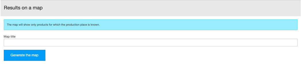
Downloading the data you just selected
Of course, you can create many more by downloading data and analyzing it with software like Libre Office, Open Refine or Microsoft Excel.

3. Enjoy
And what are your ideas?
What kind of graphics would you like to be able to create with the data from Open Food Facts. It goes without saying that pie charts have their place on Open Food Facts. ;-)
What other data would be interesting to visualize on the axes of the "product cloud"?
If you generate interesting graphics, you can share them as a comment to this article, I'm very interested to see how this kind of feature can be used and useful.